The better way to explain your UX/UI design
Being UX/UI designers, we are not only creating the design that works, but we need to explain the rationale behind our designs to other stakeholders, who could be users, clients, development team, investors or product owners, etc. By doing that, we are helping others to understand the context, so they know what are the main purposes of not only each single element but also the overall picture of our design.
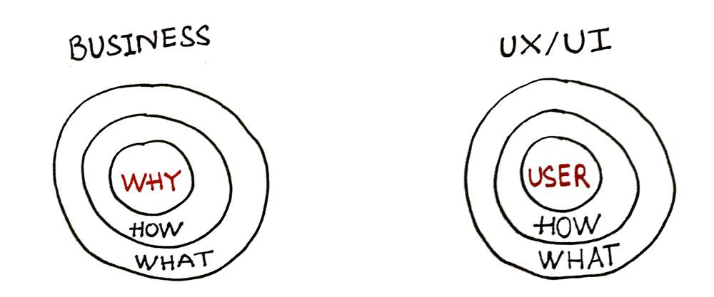
Inspired by “Start with Why” by Simon Sinek, I have reflected on my own way of explaining and also observed other designers to see how can we improve our way of delivering our visual messages, with the correct “Why”.
Fact #1: How we — UX/UI designer usually explain our design
“I chose this layout because it’s consistent with the other screens of the app”, “I chose these colors because they are global trending nowadays”, “I used Materials design because we are focusing on Android’s users”. Do those explanations sound familiar to you? 🙂

That form of UI explanation seems a very popular way to explain the rationale behind every design, by doing that we are explaining the design from the designer’s perspective. We are focusing more on the “What”.
Fact #2: Does user really care about “design technical rationale”?
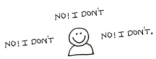
Actually, the user doesn’t care about consistency or trending colors, or even the design language you are using. Average users use the product in order to achieve their goals: Order some things, read some news, or chat with friends… However most of the time we tried to explain our design using design technical terms and of course, it sounds professional, it is correct, but it doesn’t bring so much value to users or other stakeholders.
Fact #3: Do other non-user stakeholders really care about “technical rationale”?
Each role in the software development process has different responsibilities and different goals. The project leader doesn’t really care about the design style you are using unless it impacts to project plan, the developer cares more about implementation possibilities as well as consuming effort. So better to not confuse and consume their time by “noises”. We — UX/UI designers are hired to do our job, not to teach or tell others on design theories, obviously 🙂
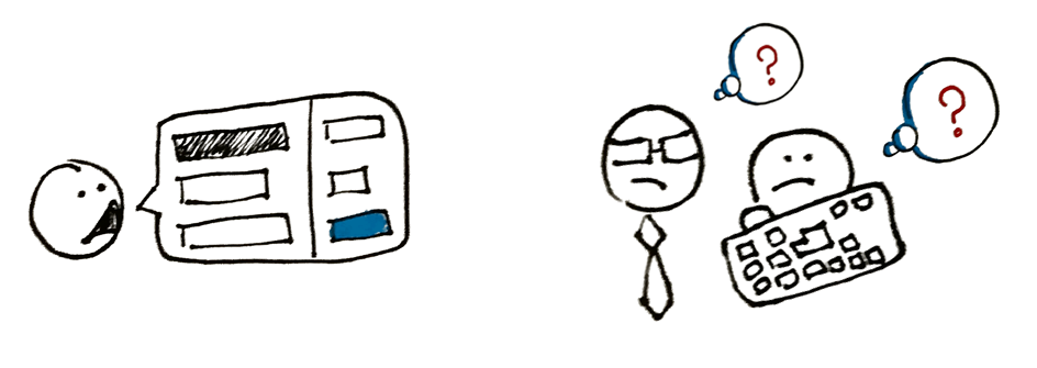
Of course, there will be non-designer stakeholders who prefer to investigate design stuff, but better to save it for coffee talk and share.
How can we do it in a better way?
“I chose this layout because it helps the user to read the content easily following Z -pattern”, “I used this color because the low-contrast with real environment won’t hurt user’s eyes after a long duration of using”, “The button is placed on the bottom right corner so user can easily reach it when needed”.

Applying user-centered design, everything we design must be beneficial to the user. So the better way to explain the design is focusing on the correct “Why” we made it for the user, in other words, what are the values to users.
“Users don’t use what you design, users use why you design it!”
(That’s my new quote, steal like an artist :P)
Please keep in mind, in order to deliver the correct explanations with the correct “Why”, we have to execute usability testing rounds beforehand to make sure it is really valuable for the user, do not try to explain based on your assumptions and thoughts 🙂
Wrap up
There are a lot of things to be considered when we design every single pixel, from the design language, consistency, etc. (designer’s perspective) to consuming effort to implement, technical limitation, etc. (developer’s perspective) to extra spending effort impacts to budget/timing/scope (project plan’s perspective)… but on top of that, the usability of the product is still the most important thing to consider when we design, so if you need to explain your design to other stakeholders, let give the usability the highest priority beyond other aspects: Benefits/values to the user.
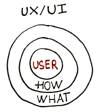
I have been trying to explain my design with the user in the center, and I have encouraged my colleagues to do the same as well. After a short duration, I can obviously recognize the improvements in the way of communication between stakeholders, with the user in the center. Also, the team can even figure out some rooms for improvement in design when we were trying to explain the design with the “correct Why”. Remember: “Users don’t use what you design, users use why you design it!”


